Icon types

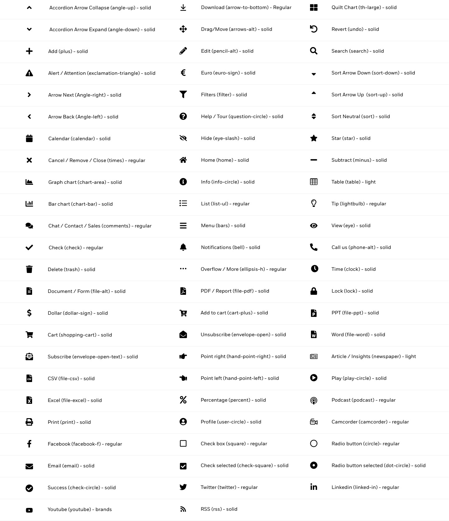
We use two types of icons at BlackRock: Pictograms, which are used as a visual cue to help quickly communicate a theme, idea, or topic, and Functional icons, to perform specific user actions.

Our Functional icons are set in our CMS, and hard coded in to our component system. It is not something that can be edited outside of the core design team.

Paragraph-2,Multi Column Teaser-1,Paragraph-3,Paragraph-4
Paragraph-5,Paragraph-6
Paragraph-7,Multi Column Teaser-2,Paragraph-8
Paragraph-9,Image-1

Pictograms

Our pictograms are used to depict a range of subjects, products, services, applications, and functions. They are used as a visual cue to help quickly communicate a theme, idea, or topic. They help simplify and delineate complex layouts, creating simpler, more impactful designs. Always use pictograms that are relevant to the topic you are communicating.

Pictograms are never used for decoration, are not illustrations, and they should not be used in place of illustrations. Illustrations are in progress and guidelines will be added in the coming months.

Skillful risk management
Proprietary technology
Bringing transparency to investing

Note: BlackRock pictograms always contain three brand colors: orange, yellow and pink. Pictograms (and illustrations) are never to be used on any background color other than black or white.
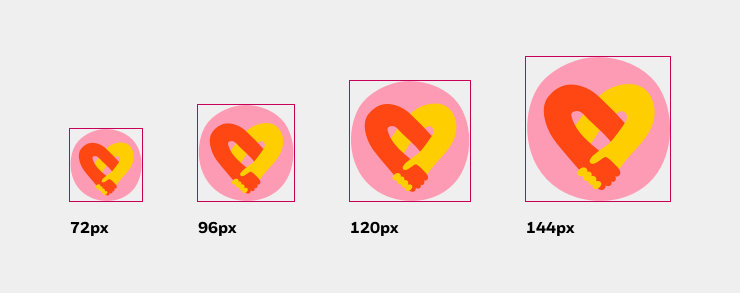
Pictograms brand color

Pictogram sizes

Our pictograms look best when sized between a minimum of 72px and a maximum of 144px. This aligns to our 8px grid system.

This is just a recommendation, and you may need to use the pictograms at a slightly larger size depending on your design needs.

Note: The magenta box is illustrating the container size.

Pictogram size

Pictograms vs illustrations

We use pictograms at a much smaller scale than we use our illustrations. We use them to depict a range of subjects, products, services, applications, and functions. The pictograms should always be associated with descriptive text.

Pictograms are not illustrations, and they should not be used in place of illustrations.

Illustrations are best used when it does something photography can’t. Our illustrations are used as metaphors to help visualize a range of complex topics in an engaging way. Illustrations contain more detail and nuance.

Pictogram do's

Do. Use pictograms to depict a range of subjects or products.

Pictogram do's

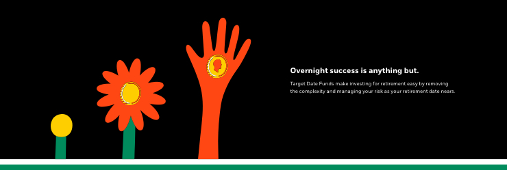
Do. Use illustrations in an intelligent way to help communicate a complex topic.

Pictogram dont

Don’t. Don’t use pictograms at this scale.

Additional do nots


Do not distort Do not add shadow Do not add rotate Do not outline
Do not do distort pictograms. Do not add drop shadows, glows, or any other effects to pictograms. Do not rotate pictograms. Do not outline pictograms.
Do not crop Do not repeat Do not alter color Do not separate structure
Do not crop pictograms. Do not repeat pictograms or make any type of patterns. Do not alter the color of pictograms. Do not separate or alter the structure of Pictograms.


Curated pictogram library

In partnership with Global Creative Services, a pictogram library was created for digital use around BlackRock’s properties (web, apps, tools, etc.). Just grab the code name(s), and send them to your publisher, no need to cut any assets.

Note: Only use the dox site to view the pictograms. We have a TeamSite library already optimized as .svg assets to pull from. See Rules section below for .svg directory.

pictogram code name reference

This digital pictogram menu is subject to changes based on future evolution by the Creative Service team. For more information, please contact Creative Services.


Rules and recommendations

Naming convention

All pictogram codes follow a standard filename: theme-name.svg

Do not include any pixel or shirt sizes in the filename. Because SVGs are flexible vectors that will be sized by the component, you will not need to "resize" or "crop" a pictogram on a page.

Here are components that are built to support SVG icons:
Multi-column teaser
CTA w/ image (small skin)

Asset types

Only use SVGs for icons in the CMS going forward.

To request an icon to be used on your page (internally), simply provide your publisher the file name of the icon you'd like to use. Within the CMS, pictograms can be found in the following folder: /shared/images/media-bin/web/global/svg/icons and follow the same naming convention dictated here.

Please discontinue use of PNG, JPG, and GIF icons in the CMS.


Functional icons

Functional, or system icons represent very specific user interface actions. They should depict a clickable action or command - download, share, print, search, etc.

At BlackRock, we leverage the Font Awesome 5 Pro font toolkit. Font Awesome provides scalable vector icons that can instantly be customized without losing any of the details and nuances.

Font Awesome is loaded in our CSS, so there is nothing more than giving the icon unicode to developers to implement it.

Cancel / Remove / Close
unicode: fa-times
Download
Download
unicode: fa-download
Search
Search
unicode: fa-search
Info
Info
unicode: fa-info-circle

Note: Functional icons should never be abstract. Consistency is key to ensure they are universally recognized across our interfaces.

functional icon

Functional icon sizes

Our functional icons are set to specific sizes across our component system. Generally, we use 16px icons for CTAs, but there are also varying sizes used across our platforms, such as search bars, “close” triggers, tools/application functions, etc.

This is just a recommendation, and you may need to use the functional icons at a slightly different size depending on your design needs.These should match our 8px grid system.

Note: The magenta box is illustrating the recommended container size.

Functional Size

Additional do nots

Additional do not

Don’t. Don’t use functional icons in place of pictograms.

Additional do not

Don’t. Don’t use functional icons as decoration or in place of illustrations.


FontAwesome 5 Pro

For standard usage, please use the icons listed below to ensure consistency across products & interactions. All icons are part of the Font Awesome 5 Pro font toolkit. This list describes which icon is used for what kind of action along with its Font Awesome name (in parenthesis) and font weight (solid/light/etc.)

This is a WIP and may change according to UX team alignment discussions.

fontawesome icon matrix