Pull quote (vi20)
Pull quotes are excerpts, key phrases or opinions that are pulled from an article/insight and used as graphic elements within a page layout to draw the reader in and to break up large blocks of text. Pull quotes can serve as visual signposts to help give the reader a sense of place and sequence.
Pull quotes should be kept brief to maintain visual balance on the page.
One key feature to note:
- In this component, you have the ability to turn component-level top, bottom or both padding options on or off
- Note: Use this is to solve “double” padding issues when stacking similar colored components together which may cause large gaps to appear
- See example here
Publishing? View the DCR guidebook for detailed instructions.
Left aligned appearances
Our Left aligned appearance should only be used between 2 blocks of paragraph copy. It aligns perfectly with our paragraph component, and comes in 2 sizes, and neither option allows for a profile picture (to not visually disrupt the content too much):
Small: Use this option if you don’t want to visually interrupt the content too much. It’s more subtle than our “large” appearance, and does not take up as much space.
Large: Use this option if you need a more “impactful” visual appearance.
- Padding usage note: By default, the bottom padding is set to off. This is to maintain equal spacing between two paragraph blocks.
- This should remain off whenever this component sits in the middle of multiple paragraphs/sections.
- If it is the LAST component in your paragraph, (i.e. sits above a full-width component), then have the publisher uncheck the “hide bottom padding” option in the DCR.
- See example here
Small appearance
Lorem ipsum dolor sit amet, consectetuer adipiscing elit. Aenean commodo ligula eget dolor. Aenean massa. Cum sociis natoque penatibus et magnis dis parturient montes, nascetur ridiculus mus. Donec quam felis, ultricies nec, pellentesque eu, pretium quis, sem.

As I’ve said before, my hope is that in the future, every investor – ultimately including individual investors – has access to voting choice, if they want it.
Lorem ipsum dolor sit amet, consectetuer adipiscing elit. Aenean commodo ligula eget dolor. Aenean massa. Cum sociis natoque penatibus et magnis dis parturient montes, nascetur.
Large appearance
Lorem ipsum dolor sit amet, consectetuer adipiscing elit. Aenean commodo ligula eget dolor. Aenean massa. Cum sociis natoque penatibus et magnis dis parturient montes, nascetur ridiculus mus. Donec quam felis, ultricies nec, pellentesque eu, pretium quis, sem.
Capitalism has the power to shape society and act as a powerful catalyst for change.
Lorem ipsum dolor sit amet, consectetuer adipiscing elit. Aenean commodo ligula eget dolor. Aenean massa. Cum sociis natoque penatibus et magnis dis parturient montes, nascetur.
Rules and recommendations

| Component element | Optional element | Rules |
|---|---|---|
| A: Background color options | • Only BLK_White with yellow quote container (can not be changed) | |
| B: Quote | • No character count - try to keep it short | |
| C: Attribution name |
|
|
| D: Title / Role |
|
Center aligned appearances
Our Center aligned appearance is centered in the browser and should be used with other full-bleed components. This appearance also come in 2 sizes, “Small” and “Large”.
Small
Use this option if you don’t want to visually interrupt the content too much. It’s more subtle than our “large” appearance, and does not take up as much space.
- You can turn off the profile picture, attribution name, and title to reduce the height even more if you need

As part of helping our clients to align their investments to net zero, we are proud to invest in sustainable infrastructure across the UK; from wind farms in Grimsby to solar power production in Pembrokeshire, which power 1.8 million British homes each year.
Large
Use this option if you need a more “impactful” visual appearance. It should be used for specific high-traffic campaign pages, and should help set up diverse and related content for visitors to explore. We recommend using this appearance sparingly and getting pre-approval from the design team prior to rolling your page out.
As part of helping our clients to align their investments to net zero, we are proud to invest in sustainable infrastructure across the UK.
Rules and recommendations

| Component element | Optional element | Rules |
|---|---|---|
| A: Background color options |
|
|
| B: Quote | • No character count - try to keep it short | |
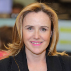
| C: Profile picture |
|
|
| D: Attribution name |
|
|
| E: Title / Role |
|
Alternate variations
To help you visualize different possible layouts and background colors, we stacked a few components together to give you a more clear understanding of how this could look.
Here you can see:
- Appearance with profile picture set to hidden in BLK_White with top/bottom borders
- Appearance with no profile, name, or title

As part of helping our clients to align their investments to net zero, we are proud to invest in sustainable infrastructure across the UK; from wind farms in Grimsby to solar power production in Pembrokeshire, which power 1.8 million British homes each year.
As part of helping our clients to align their investments to net zero, we are proud to invest in sustainable infrastructure across the UK; from wind farms in Grimsby to solar power production in Pembrokeshire, which power 1.8 million British homes each year.
Center aligned examples
Below you can see some sample layouts for our center aligned appearance. This is strictly a visual example and to help guide best-practices.
Reminder — Key feature to note:
- In this component, you have the ability to turn component-level top, bottom or both padding options on or off
- Note: Use this is to solve “double” padding issues when stacking similar colored components together which may cause large gaps to appear
- See example here
