Homepage hero banner

The Homepage banner is used for global .com homepage experiences. It allows for a hero content section, which should be updated regularly with current global activations or localized campaigns.

Built in to this banner are additional content buckets that live “above the fold” to highlight 2 - 3 high-level content pieces to help drive the users deeper in to a journey.

We’ve baked a few key features into this component, including the ability to:

  • Have total control of how the image crops
  • Showcase 2 or 3 pieces of content below the hero, along with 2 color options
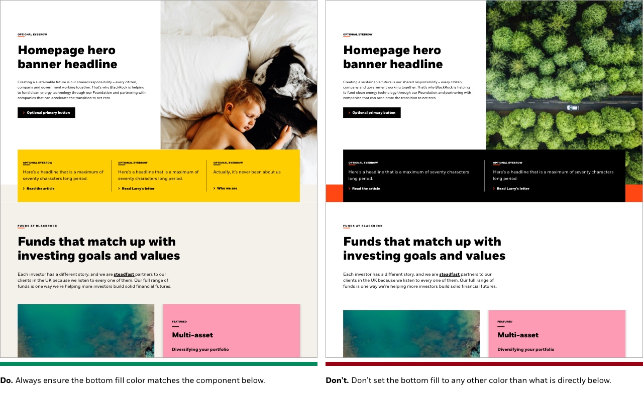
  •  Ability to change the bottom border color when stacking similar-colored components for a seamless transition


Publishing? View the DCR guidebook for detailed instructions.


Optional eyebrow

Homepage hero banner headline

Optional eyebrow

Here's a headline that is a maximum of seventy characters long period.

Optional eyebrow

Here's a headline that is a maximum of seventy characters long period.

Read Larry’s letter

Actually, it’s never been about us

Bottom fill options

If you are pulling in a component below the hero banner that has a background other than white, it is important to choose the same “bottom fill” color choice so there is not a white gap between the components. This aids in a seamless transition between the Homepage hero banner and content below.

We have built in a few brand color choices depending on which content background choice you select, and the matrix is listed in the Rules section below. You must choose a component that allows the same color as the bottom fill piece.


Rules and recommendations 1

Do’s & Do nots

image placement center

Rules and recommendations

Rules and recomendation
Component element Optional element Rules
A: Background color options
  • BLK_White ONLY
B: Eyebrow
  • Character count: ~35*
  • Used for anything user-journey related - page titles, section titles (i.e. “Who we are”)
C: Headline
  • Headline character count: ~70*
D: Body copy
  • Body character count: ~350*
  • Ability to include hyperlink
  • Stylization: Italic, bold capabilities
E: Hero CTA
  • CTA can be either a primary button or a tertiary link
  • • Keep these "digital" friendly; i.e. short descriptors
F: Image
  • • Image dimension: 860x839px graphic (JPG/PNG)
  • • Graphics are cut wider to accommodate responsive layouts
  • • Image alignment: right side only
  • • Image position lock — see demonstration here
    • • Center of the image container
    • • Left side of the image container (default position)
    • • Right side of the image container
  • All image assets must be optimized for the web: <300kb
G: Callout box background color options
  • • BLK_Yellow (default)
  • • BLK_Black
g1: Bottom fill color choices
  • When stacking any full-bleed component below, you have the flexibility to choose from a select-few bottom border color options. This is to accomplish a seamless transition between components
  • • Logic > If choose callout container primary color:
    •   • BLK_Yellow > bottom fill options: White, Neutral, Black
    •  • BLK_Black > bottom fill options: White, Neutral, Yellow, Orange
g2: Callout box content
  • • Can show 3 topics (default) or 2 topics
  • • Same rules apply for each “topic section”, and do not change between 2 or 3 topic appearance choice
  • Optional: Eyebrow character count: ~35*
  • Mandatory: Headline character count: ~70*
  • Mandatory: CTA is tertiary link only
    • • Keep these "digital" friendly; i.e. short descriptors
*NOTE: Due to varying alphabets and character widths, please ensure your publisher tests this prior to release