Component accessibility
It is critical that we provide an accessible experience to all users of our site. When you use components and create webpages, it’s expected that you’ll provide such an experience by including the key information outlined below to the publishing team.
As a global firm, we must adhere to ADA compliance WCAG 2.1 Level AA. This page is designed to give you an overview of accessibility as it relates to the component system but does not cover all aspects of it. For more information on accessibility at BlackRock please visit the Accessibility hub (available to internal users only).
Inclusive design
At BlackRock, we believe in inclusive design, which means we aim to consider and include all people when we design. Inclusive design benefits people within a wide range of scenarios, whether that’s permanent, temporary, or situational.
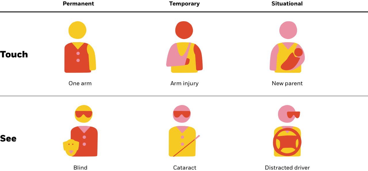
Reference: Microsoft's Inclusive Design Kit
Intro to Accessibility
When websites and web tools are properly designed and coded, people with disabilities can use them. However, currently many sites and tools are developed with accessibility barriers that make them difficult or impossible for some people to use.
Making the web accessible benefits individuals, businesses, and society. International web standards define what is needed for accessibility.
Web accessibility means that websites, tools, and technologies are designed and developed so that people with disabilities can use them. More specifically, people can:
- perceive, understand, navigate, and interact with the Web
- contribute to the Web
Web accessibility encompasses all disabilities that affect access to the Web, including:
- auditory
- cognitive
- neurological
- physical
- speech
- visual
Web accessibility also benefits people without disabilities, for example:
people using mobile phones, smart watches, smart TVs, and other devices with small screens, different input modes, etc.
- older people with changing abilities due to aging
- people with “temporary disabilities” such as a broken arm or lost glasses
- people with “situational limitations” such as in bright sunlight or in an environment where they cannot listen to audio
- people using a slow Internet connection, or who have limited or expensive bandwidth
Web accessibility depends on several components working together, including web technologies, web browsers and other "user agents", authoring tools, and websites.
The W3C Web Accessibility Initiative (WAI) develops technical specifications, guidelines, techniques, and supporting resources that describe accessibility solutions. These are considered international standards for web accessibility
Resource on Native Web Accessibility Easy Checks – A First Review of Web Accessibility | Web Accessibility Initiative (WAI) | W3C
Easy Checks – A First Review of Web Accessibility | Web Accessibility Initiative (WAI) | W3C
What is an ARIA label?
WAI-ARIA is intended to be used as a supplement for native language semantics, not a replacement. When the host language provides a feature that provides equivalent accessibility to the WAI-ARIA feature, use the host language feature. WAI-ARIA should only be used in cases where the host language lacks the needed role, state, and property indicators. Use a host language feature that is as similar as possible to the WAI-ARIA feature, then refine the meaning by adding WAI-ARIA. For instance, a multi-selectable grid could be implemented as a table, and then WAI-ARIA is used to clarify that it is an interactive grid, not just a static data table. This allows for the best possible fallback for user agents that do not support WAI-ARIA and preserves the integrity of the host language semantics. More info can be found here Accessible Rich Internet Applications (WAI-ARIA) 1.1 (w3.org)
Commonly used on landing pages
Page structure and headings
Headings are ranked <h1> through <h6>. Use headings hierarchically(link is external), with the <h1> representing the most important idea on the page, and sub-sections organized with <h2> level headings. Those sub-sections can themselves be divided with <h3> level headings, and so on.
All pages should at least have a <h1> level heading giving the title of the page.
Do not skip heading levels to be more specific (for example, do not skip from <h2> to <h5>). It is permissible to skip headings in the other direction if the outline of the page calls for it (for example, from <h5> to <h2>).
ARIA role=heading
In some cases, such as legacy websites or applications, semantic heading tags may be impossible or unadvisable. In such cases, it may be possible to add ARIA attributes to existing tags in order to change their semantics. To change an element’s default semantics into a heading, use role=heading and an appropriate aria-level. This approach should be seen as a last resort.
Page Structure Tutorial | Web Accessibility Initiative (WAI) | W3C
Landmarks
A landmark is an abstract role for a section of content that is important enough that users will likely want to be able to navigate to the section easily and have it included in a dynamically generated summary of the page. Landmarks allow assistive technologies to navigate and to find content quickly.
To create a landmark role, define the purpose of the content by using a semantic element such as <section>, <nav>, or <main>, or adding an ARIA role that is a subclass of the landmark role such as role="banner", role="complementary", or role="region". Do not use role="landmark".
A visible label should be provided, referenced with aria-labelledby. If necessary, brief, descriptive, label can be provided with aria-label.
For screen reader users, adding landmark roles effectively create 'skip links' for screen reader users, but don't replace in page navigation as the landmark roles are not otherwise surfaced.
Best Practices
Do not use role="landmark". Do use HTML and subclass landmark roles.
Landmarks ensure content is in navigable regions. Use <main> for role="main", <header> for role="banner", <nav> for role="navigation", and <footer> for role="contentinfo". It is also good practice to include the role redundantly with the associated semantic element. It is not as good practice to use non-semantic elements, such as <div>, adding semantics with landmark roles. But do include one or the other or both. Otherwise, your content is no longer as navigable for screen reader users.
ARIA11: Using ARIA landmarks to identify regions of a page | Techniques for WCAG 2.1 (w3.org)
Buttons
* ARIA: button role
The button role is for clickable elements that trigger a response when activated by the user. Adding role="button" tells the screen reader the element is a button, but provides no button functionality. Use <button> or <input> with type="button" instead.
The button role identifies an element as a button to assistive technology such as screen readers. A button is a widget used to perform actions such as submitting a form, opening a dialog, canceling an action, or performing a command such as inserting a new record or displaying information. Adding role="button" tells assistive technology that the element is a button but provides no button functionality. Use <button> or <input> with type="button" instead.
This button role can be used in combination with the aria-pressed attribute to create toggle buttons.
ARIA: button role - Accessibility | MDN (mozilla.org)
Links
* Links Must be Clear and Descriptive
All links should be able to standalone and still give meaning to the user. Even without text around the link, users should have a good understanding of what a link is going to lead them to. This makes it easier for all users, not just those with disabilities, to navigate your content.
Entire hyperlinks, and links that are presented simply as "click here" or "click for more" are considered to be not accessible.
WebAIM: Links and Hypertext - Introduction to Links and Hypertext
Link Examples | APG | WAI | W3C
Form fields and labels
* Labels need to describe the purpose of the form control. This section of the tutorial describes how to provide labels that are properly associated with form controls. Later sections explain how to provide instructions, validate user input, and provide feedback to help users complete your form.
A label and a form control should be associated with each other either implicitly or explicitly. Web browsers provide the label as a larger clickable area, for example, to select or activate the control. It also ensures that assistive technology can refer to the correct label when presenting a form control.
Labeling Controls | Web Accessibility Initiative (WAI) | W3C
Tables
The purpose of data tables is to present tabular information in a grid, or matrix, and to have column or rows that show the meaning of the information in the grid. Sighted users can visually scan a table. They can quickly make visual associations between data in the table and their appropriate row and/or column headers. Someone that cannot see the table cannot make these visual associations, so proper markup must be used to make a programmatic association between elements within the table. When the proper HTML markup is in place, users of screen readers can navigate through data tables one cell at a time, and they will hear the column and row headers spoken to them.
Images
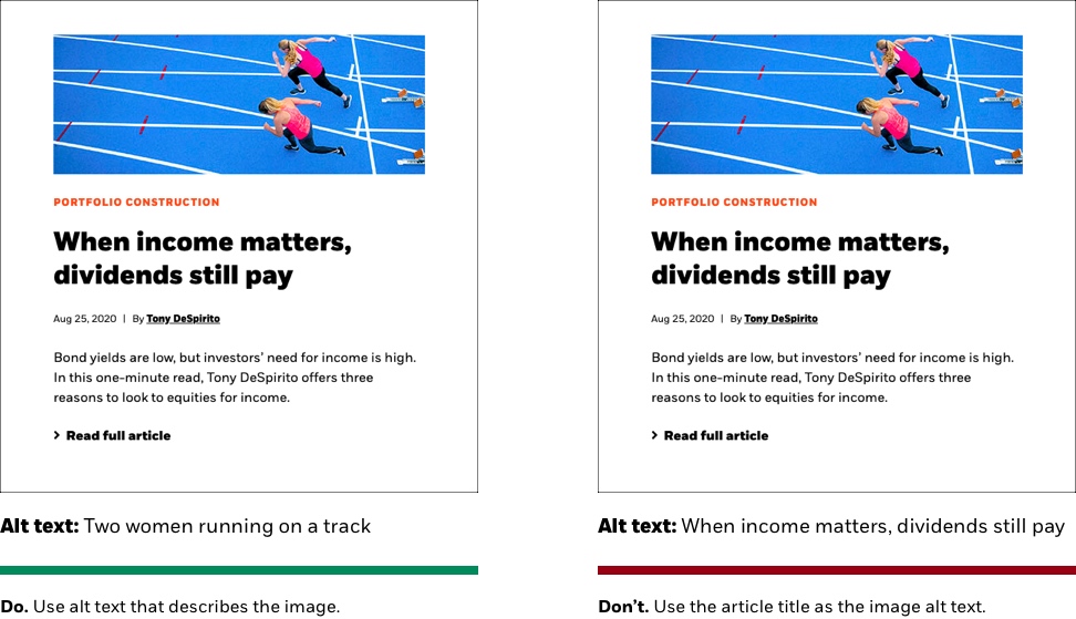
Most images require alt text to make them accessible.
What is alt text?
Alt text is hidden text used to describe the image for those who cannot see it.
Types of images and alt text
The purpose of your image will dictate the alt text. The most common type of image is “Informative."
| Image Purpose | Description | Alt Text |
|---|---|---|
| Decorative | Conveys no new information or emotion | Empty (alt=“”) |
| Informative | Convey information, emotion, mood, etc. | Short description of image, emotion, mood |
| Complex | Graphs, diagrams | Tools and guidelines under development. |
| Functional | Initiates an action (linked image) | Description of the function/destination, not the image |
| Text | Image of text (not recommended) | Same as text in image |
Dos and Don’ts
PRO TIP: If you’re downloading an image from our brand library Dox site the description is often a good starting point for alt text:

Color contrast
At BlackRock, we need to meet WCAG 2.1 AA standards:
- Text must have a contrast ratio of at least 4.5:1. An exception is large text (at least 24px book / 18px bold) which must have a contrast ratio of 3:1
- As a rule of thumb, we set all type to BLK Black for all component background appearances except for components set with black background appearances, which we set to BLK White
- The only text we set in a color other than black or white is our Eyebrow text, which is used to highlight a topic or theme in smaller text above headlines