Related material
The vi-16 Related materials component is a flexible component that uses tiles/cards to share any combination of three content types: product (funds), page content, and/or link list.
Add this component to a page to highlight and direct users to relevant content. You can link directly to further reading on a topic, a fund, or a collection of links. As well as linking to another page, you can also create a direct file download from the link list card.
The combination of cards displayed is up to you, you need a minimum of 2 and there is a maximum 6 in any combination.
Publishing? View the DCR guidebook for detailed instructions.
Tile sets
As mentioned above, the combination of cards displayed is up to you, you need a minimum of 2 and there is a maximum 6 in any combination.
The product tiles have the ability to dynamically pull in the live data directly from the product page using the fund’s product ID, and remains updated with it’s current values.
We’ve baked many features into this component, including the ability to:
- 3 optional headline size options:
- X-Large (this automatically displays a larger intro text)
- Large (this should be your default, as it matches our standard paragraph headline sizes)
- Medium
- Optional intro blurb
- Pull in real-time product/fund information (Product tiles)
- Pull in dynamic data, i.e. headlines from pages that you’re linking to/from (Content tiles)
- Full-bleed, or offset background options. See examples below
- Optional top padding (only for new “Standard” or “Offset” appearances). See “Appearance” tab for details
Rules and recommendations
For “Offset” guidance and rules, please see the next tab “Appearance & Teamsite guide”. This will show the bottom border color options and explain how to best use it.

| Component element | Optional element | Rules | ||
|---|---|---|---|---|
| A: Background color options |
|
|||
| B: Headline & intro blurb |
|
|||
| C: Product tile(s) |
|
|||
| D: Content tile(s) |
|
|||
| E: Link list tile(s) |
|
|||
| F: Component CTA |
|
|||
| *NOTE: Due to varying alphabets and character widths, please ensure your publisher tests this prior to release | ||||
Alternate variations
To help you visualize different possible layouts and background colors, we stacked a few components together to give you a more clear understanding of how this could look.


Main appearances
This component has three appearance options, along with three tile “content types” for any of the 3 choices below, as detailed above.
We recommend using the new appearance option “Standard” or “Offset” appearances, as we slowly decommission the “Default” appearances across our site.:
- Default (this is our legacy appearance - what you see on most of the pages today)
- Standard (this is our new appearance with more options and updated look)
- Offset (this is our new appearance with more options and updated look)
The biggest visual difference is the new “Standard” & “Offset” appearances both have drop shadows on the tiles, along with intro text inside the content tiles, where the “Default” does not.
Offset appearance
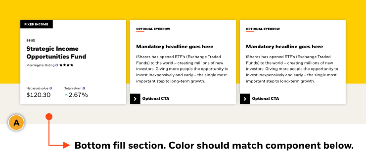
With our new offset appearances, the tiles sit below the color background, allowing for a more connected visual flow to a related topic/component below. It is important to use this correctly, and to implement the correct “bottom fill” section to ensure this visually aligns to the component stacked below.
We have implemented 2 pre-selected “bottom fill” color options to ensure a seamless stack of different colored components. See below for how this works.
Note: This must get pre-approval to ensure proper use.
Bottom fill
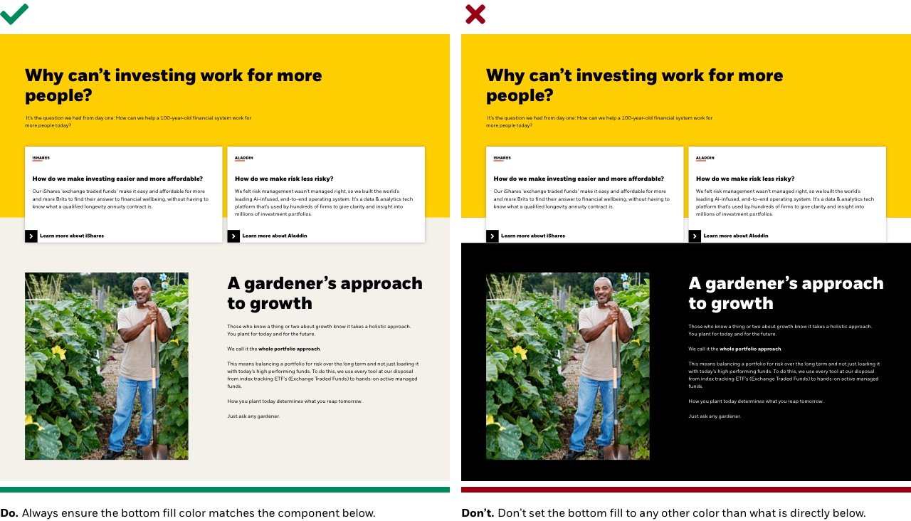
When using this offset appearance and tying it to another related section, it is important to choose the same “bottom fill” color choice so there is not a white gap between the components. This aids in a seamless transition between the Related materials component and content below.
We have built in a 2 brand color choices, and you can see them in Rules section below. You must choose a component that allows the same color as the bottom fill piece.
Note: This option is in the Related materials DCR, not a separate component.

| Component element | Optional element | Rules |
|---|---|---|
| A: Offset bottom fill |
|
Do’s & Do nots

Padding options
We have built in the ability to turn component-level top padding on or off. This is to solve “double” padding issues when stacking similar colored components that are related topic-wise.
Example: If you are using a component that has 80px of bottom padding, and you pull in a separate component right below it that has 80px top padding, then you’ll get a large gap of “negative” space. You can turn off the top padding to reduce the gap, and allow the user to visually understand these two components are part of one single topic.
NOTE: This should only be used when stacking similar colored components together. Please get pre-approval for guidance from the Design Platform team.
