Component name: Image / Full width appearance

Rules and recommendations
A. Full width:
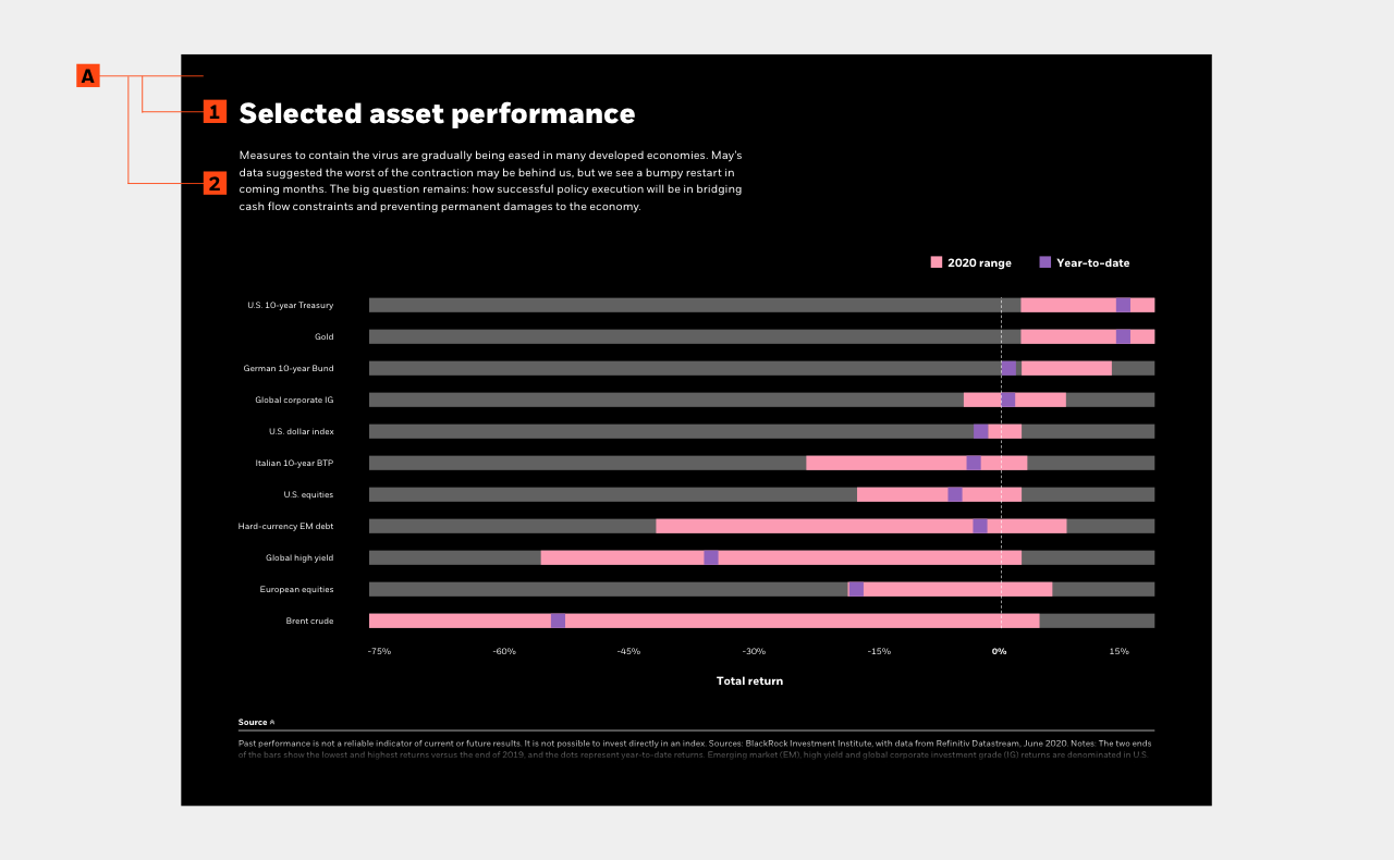
Use this option to highlight a chart that contains a lot of complex information. The larger width will help a user see and understand the data more clearly.
A1. This headline has two size options and maxes out at seventy characters.
A2. Use this optional intro as a suporting blurb that introduces what the purpose of the chart/graph/data point is. It should be relevant to the page topic, and used to support claims or insights. This maxes out at 350 characters, and allows for a hyperlink.
PRO TIP: Use the large headline appearance if you are using this to introducing a new content section to your page; think of it as your H2. If this is used as support for an established section, use the “medium” size headline (H3).
Additional component option: Video paragraph appearance
In lieue of either one or both components listed above, you have the flexibility to switch them out for our Video paragraph appearance component.

Rules and recommendations
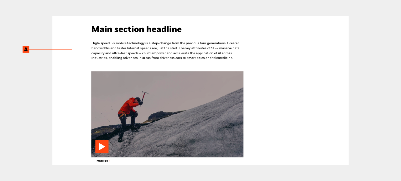
A. Video paragraph appearance:
Our paragraph appearance aligns to our paragraph, so it tucks nicely inside your content block. It’s fully responsive and will automatically scale according to device. Use this appearance when you are discussing an in-depth topic and want to introduce a related video for your users.
PRO TIP: Use the large headline appearance if you are using this to introducing a new content section to your page; think of it as your H2. If this is used as support for an established section, use the “medium” size headline (H3). Or you can just add the video player with or without the playlist directly below a paragraph for a seamless transition.
Additional component option: Simple table
In lieue of either one or both components listed above, you have the flexibility to switch them out for our Simple table component.

Rules and recommendations
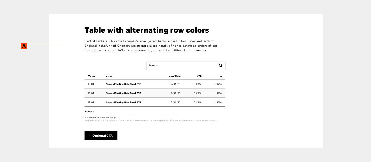
A. Simple table:
The Table component is a very versatile component that should be used to organize data and information that is too detailed or complicated to be described adequately in the text, allowing the reader to quickly see the results. They can be used to highlight trends or patterns in the data and to make a webpage more readable by removing numeric data from the text.
PRO TIP: Use the large headline appearance if you are using this to introducing a new content section to your page; think of it as your H2. If this is used as support for an established section, use the “medium” size headline (H3).